

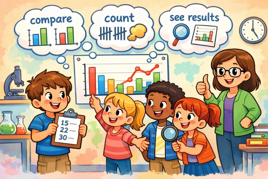
When a child finishes a science experiment, they are often left with a page full of numbers and observations. To a young scientist, this raw information can look like a confusing jumble. This is where the power of visuals and charts comes into play. In primary education, particularly within the KS2 science curriculum, children are taught that presenting data is just as important as carrying out the experiment itself. By turning numbers into a visual story, kids can see exactly what happened during their investigation.
In school science, the two heavyweights of data representation are the bar chart and the line graph. While they might look similar to a beginner, they serve very different purposes. Learning to plot data correctly helps students aged 7–11, including those following BBC Bitesize resources and beyond to develop “working scientifically” skills. This guide explores how to help children choose the right way of presenting their hard-earned results, ensuring their scientific data is clear, accurate, and easy to understand.
Purpose of Graphs and Charts in Presenting Scientific Data
The ultimate goal of any experiment is to answer a question. “Which liquid melts ice the fastest?” or “How does the height of a ramp affect how far a car rolls?” A data display acts as a bridge between the experiment and the answer. It transforms abstract numbers into a visual form that the brain can process much faster than a list of figures.
Why Graphs Are Used in Kids’ Experiments
Charts are a great way to help children compare results and see differences at a glance. Instead of squinting at a table of results, a child can look at a bar chart and immediately identify the “winner” of an experiment. It makes presenting data when working scientifically more effective because it highlights the “story” of the data. For instance, if an experiment reported a significant change in temperature, a visual makes that change immediately clear.
Role of Visual Data in Science Learning
Visually representing data supports vital cognitive development. For KS2 science students aged 7-11, seeing a diagram of their results helps build observation skills. It moves them from simply taking measurements to analyzing what those measurements mean. Using interactive learning resources for KS2, such as digital tools, can further reinforce how using different data formats can change perspective on a scientific problem.
Connection Between Experiments and Graph Choice
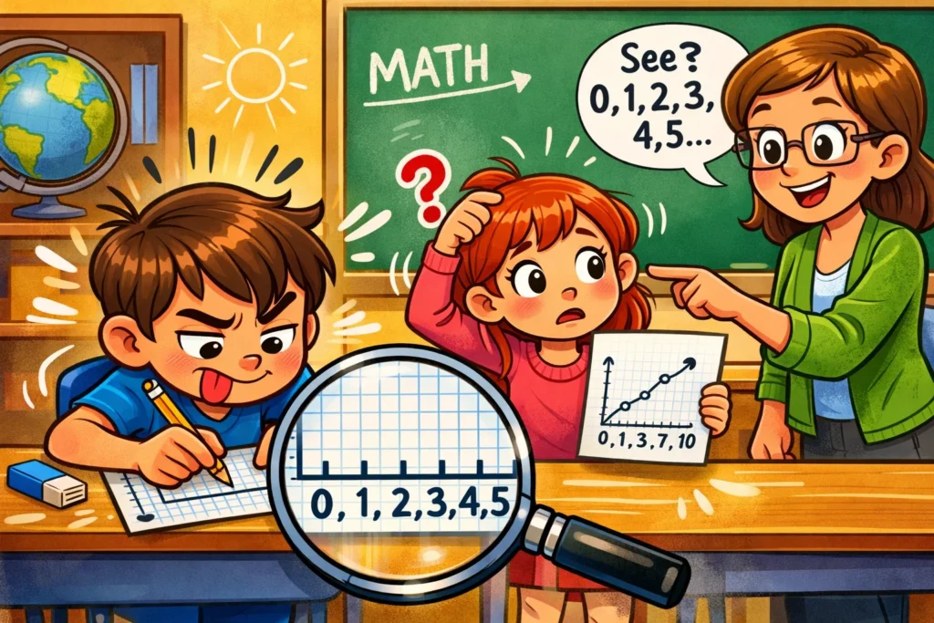
Not every experiment fits the same type of layout. The choice depends entirely on what the child is measuring. If they are looking at separate categories (like different brands of paper towels), they need one tool; if they are looking at a change over time (like a plant growing), they need another. Choosing the right graph to show results is a key part of working scientifically.
X-Axis and Y-Axis in Scientific Graphs and Charts
Before a child can place a single data point, they need to understand the “skeleton” of their diagram: the axes. Think of these as map coordinates for scientific results.
Meaning of X-Axis in Experiments
The x-axis is the horizontal axis that runs along the bottom of the page. In most KS2 experiments, this axis shows what we are changing or the categories we are comparing. For example, if a student is testing different types of balls to see which bounces highest, the “type of ball” goes on the x-axis. It often represents the independent variable—the factor the scientist changes.
Meaning of Y-Axis in Experiments
The y-axis is the vertical line that goes up the side. This is where we record our measurements, such as centimeters, seconds, or degrees Celsius. The y-axis tracks the dependent variable, which is the thing we are measuring to see how it reacts. A helpful memory trick is that the “Y” goes “high” (vertical).
Labeling Axes Correctly
Clear labels are essential. A chart without labels is just a collection of lines. Children should be encouraged to:
- Write the name of what is being measured (e.g., “Time”).
- Include the unit of measurement in brackets (e.g., “seconds”).
- Ensure the labels are oriented correctly so they are easy to read.
| Axis | Direction | What it usually shows |
| X-Axis | Horizontal | Categories or Time (Independent Variable) |
| Y-Axis | Vertical | Measurements/Numbers (Dependent Variable) |
Setting Scale When Drawing Scientific Graphs
Setting a scale is often the hardest part of drawing visuals for children. If the scale is too small, the data is cramped; if it’s too large, the page looks empty.
Choosing Number Intervals
To present the data effectively, kids need to choose even, easy-to-read number steps. Counting in steps of 5 (0, 5, 10) is much easier for a child to manage than jumping by 3s or 7s. Common intervals include 1s, 2s, 5s, or 10s. The goal is to make plotting the data point as simple as possible.
Matching Scale to Experiment Results
The scale must reflect the variance in the data. If the highest measurement in an experiment was 18cm, the y-axis doesn’t need to go up to 100. However, it should go slightly past the highest value (perhaps to 20) to give the data room to breathe. This approach ensures that different values are clearly visible.
Avoiding Scale Mistakes
Common errors include:
- Uneven spacing: Making the gap between 0 and 10 the same size as the gap between 10 and 15.
- Starting at the wrong number: Usually, a chart should start at zero to avoid distorting the results.
- Cramping: Trying to fit a large range of numbers into a tiny space.
Bar Chart for Presenting Scientific Data
Bar charts are a core tool in primary school science. They are fantastic for discrete data—information that fits into distinct groups.
When Bar Graphs Work Best
A bar chart is the best choice when you want to compare different groups. If the data on the x-axis is discrete (meaning it can’t be measured on a continuous scale, like “Type of Soil” or “Color of Flower”), a bar-style display is the way to go. It helps illustrate the difference between categories clearly.
Bar Graph Examples from Experiments
- Magnet Strength: How many paperclips can different types of magnets pick up?
- Solubility: How many spoonfuls of sugar dissolve in different liquids (milk, water, juice)?
- Friction: Which surface (carpet, wood, tile) makes a toy car stop the fastest?
Bar Graph Structure for Children
In this type of chart, the height of the bar represents the value. For kids, it’s important to emphasize:
- Equal Bar Width: Every bar should be the same width.
- Spaces Between Bars: Unlike a histogram, bar charts usually have gaps between the bars to show the categories are separate.
- Colour Coding: Using different colors for each bar can help show the relationship and make the data pop.
Line Graphs for Kids Experiments
While bar charts compare “this vs. that,” line graphs are all about “change over time.”
When Line Graphs Work Best
Use a line graph when you have continuous data. This is data that can take any value and usually involves looking at time. If you want to see how one variable affects another over a period, this format is your best friend. It is designed to show the relationship between two variables, typically time and a measurement.
Line Graph Examples from Experiments
- Plant Growth: Measuring the height of a bean plant every day for two weeks.
- Cooling Rates: Measuring the temperature of a cup of tea every minute as it cools down.
- Shadow Length: Measuring the length of a shadow every hour from morning until evening.
Line Graph Structure for Children
A line graph uses scatter plots or dots to represent the data, which are then connected by a single continuous line.
- The Plot: Each data point is placed exactly where the x-value and y-value meet.
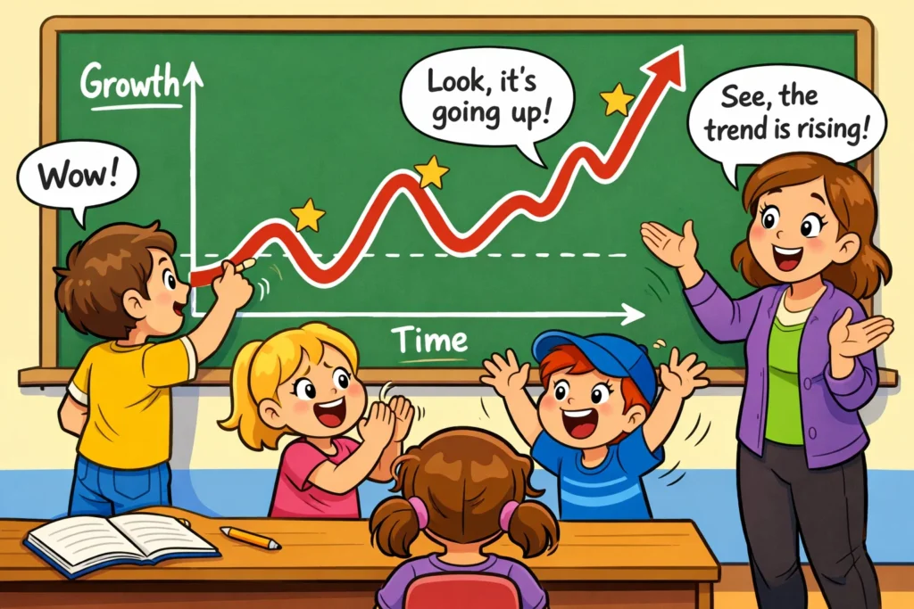
- The Line: Connecting the dots helps visually identify a trend—whether the measurement increases or decreases over time.
Bar vs Line Graph Comparison
Choosing between a chart or plot can be tricky. Here is a simple breakdown to help KS2 science students decide.
Data Type Differences
The choice depends on whether the data is discrete or continuous.
- Discrete data (Bar Chart): Separate categories (e.g., Cat, Dog, Hamster).
- Continuous data (Line Graph): Data that changes along a scale (e.g., 1cm, 1.1cm, 1.2cm).
Visual Pattern Differences
Bar charts are great for seeing “who is the tallest” or “who has the most.” They highlight numerical differences between groups. Line graphs are better for seeing patterns or trends. They show us if something is getting faster, hotter, or taller over time.
Choosing Correct Graph for Experiment Results
| If your data is… | Use a… | Because… |
| Categories / Groups | Bar Chart | It compares separate things. |
| Time / Growth | Line Graph | It shows change over time. |
| Percentages of a whole | Pie Chart | It shows parts of a total. |
Plotting Experiment Data Step by Step
Constructing visuals is a skill that improves with practice. Follow these steps to present the data accurately.
Preparing Scientific Data Before Drawing Graphs
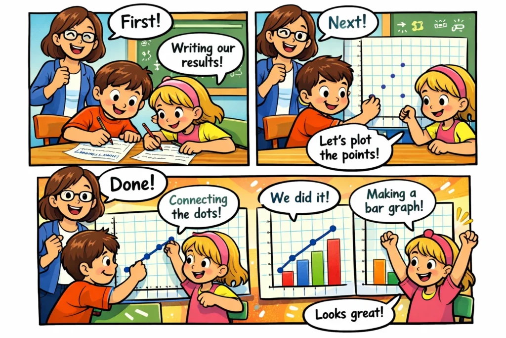
Before picking up a pencil, children should have their results organized in a table. This makes it easier to find the two values needed for each point. A messy notebook leads to a messy diagram!
Plotting Points or Bars
- Find the x-value: Locate the category or time on the bottom line.
- Find the y-value: Move your finger up to the correct measurement on the side.
- Mark it: For a bar chart, draw the top of the bar. For a line graph, draw a small ‘x’ or dot.
- Complete: Draw the rest of the bar or connect the dots to the previous data point.
Checking Accuracy
Encourage kids to “double-check” their work. Did they plot a 5 when the table said 15? Does the display show what they expected to see? Checking for obvious errors or outliers at this stage is a key part of working scientifically.
Common Graphing Mistakes Kids Make
Even the best young scientists make mistakes when presenting data. Recognizing these early helps build better habits.
Mixing Graph Types Incorrectly
One of the most common errors is using a line-based plot for discrete data. For example, connecting a point for “Apples” to a point for “Bananas” with a line suggests there is a relationship or a “middle stage” between the two, which isn’t true.
Missing Labels and Units
A visual that says “5” on the y-axis doesn’t tell us much. Is it 5 meters? 5 grams? 5 elephants? Resources for KS2 science students always emphasize that units are essential for scientific drawings.
Scale and Spacing Errors
If the numbers on the y-axis are squashed together at the bottom and spread out at the top, the graphical methods become misleading. Consistent spacing is the secret to a professional-looking chart or illustration.
Teaching Bar and Line Graphs in the Classroom
For teachers and parents, the goal is to make learning resources for KS2 science as engaging as possible.
Introducing Graph Types
Start with a “Human Bar Chart.” Have kids stand in lines based on their favorite fruit. This visually demonstrates how bars represent groups. Then, move to paper and use different ways of presenting data to show the same information, asking the kids which one looks “right.”
Using Hands-On Experiments
The best way to learn is by doing. Instead of using “fake” data, have children present data from their own experiments. When they have spent time measuring a plant, they are much more invested in drawing the results to show its progress.
Reinforcing Graph Choice Skills
Use interactive learning resources for ks2 like BBC Bitesize or online quizzes. Give them a scenario: “We measured how much a candle shrank every minute. Which plot to show this?” This builds the muscle memory for graphical methods.
Experiment Ideas for Graph Practice
Ready to start plotting? Here are some simple ideas to get those axes moving.
Simple Bar Graph Experiment Ideas
- Bird Watch: Count how many of each bird species visit a feeder in 30 minutes.
- Car Colors: Stand by a safe road and tally the colors of the first 20 cars that pass.
- Sweet Sort: Use a bag of multi-colored sweets and count how many of each color are inside.
Simple Line Graph Experiment Ideas
- Heart Rate: Measure your pulse at rest, then after 1, 2, and 3 minutes of exercise.
- Evaporation: Fill a glass with water and mark the level every day for a week.
- Melting Ice: Put an ice cube in a warm room and measure the volume of meltwater every 2 minutes.
Printable and Digital Graph Activities
There are many resources for ks2 science available online. Websites like BBC Bitesize offer interactive learning resources for ks2 where kids can input data and see the chart generated automatically. This is a great way to show how one variable affects another without the frustration of manual drawing.
Summary of Graphing Results for Kids Experiments
Learning to use charts and graphs is a vital milestone for any young scientist. It’s not just about drawing lines; it’s about learning how to display information in a way that others can understand.
Key Differences Between Bar and Line Graphs
- Bar charts compare different things (discrete data).
- Line graphs show how things change over a period (continuous data).
- Bar charts use blocks; line graphs use a series of connected points.
Graph Selection Tips for Kids and Teachers
Always ask: “Is it a category or a change?”
- If it’s a category, reach for the bar chart.
- If it changes over time, use a line graph.
- If you are using percentages of a whole, consider a pie chart.
Building Graph Skills Through Practice
The more children present data, the more natural it becomes. By working scientifically with these interactive tools and real-world experiments, they learn that science isn’t just about doing the work—it’s about sharing the story of what they found. Whether they are using simple line graphs or bar charts, they are developing the critical thinking skills that define a true scientist.
Data is just a clue until you put it into a visual; then, it becomes an answer.